1977 Lions uniform, logo and Helmet The Best Of All Time!

The Place for BC Lion Discussion. A forum for Lions fans to talk and chat about our team.
Discussion, News, Information and Speculation regarding the BC Lions and the CFL.
Prowl, Growl and Roar!

Moderator: Team Captains

tigerrr22
Starter
Posts: 157
Joined: Thu Dec 11, 2008 10:51 pm

The 1977 Helmet and uniform of the Lions is far and away the best uniform in the history of the team. This team, led by first year CFL head coach Vic Rapp, became known as the Cardiac Kids. (Numerous last second heroics was the signature of this team leading up to the Western Final in Edmonton. ) Jerry Tagge #8 was the starting QB:
Image
Lui Passaglia was just starting to hit Lions FG's from all over the place:
Image
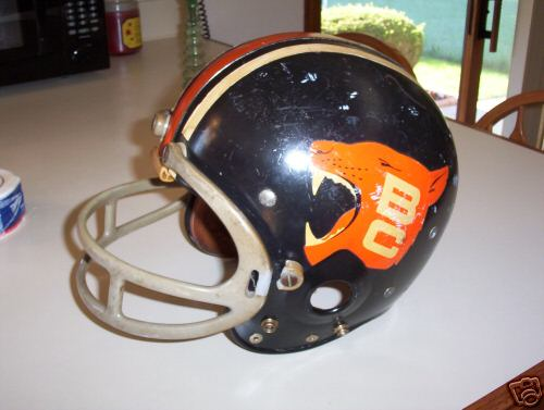
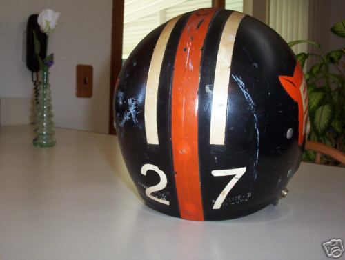
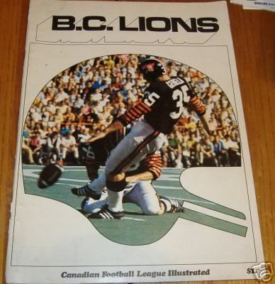
and the uniforms were the last of the black helmet era of BC Lions football. Meaning the evolution of the black helmet reached a pinnacle before the team went to the first year of white helmets, along with altered orange (home) and white (away) jerseys, in 1978. Here is a reproduction of the Lion's helmet from the 1977 season. This is the best, timeless, aggressive, forward facing and classic Lion's helmet of all time. It should be what the team wears today along with the rest of the 1977 uniforms.
Image

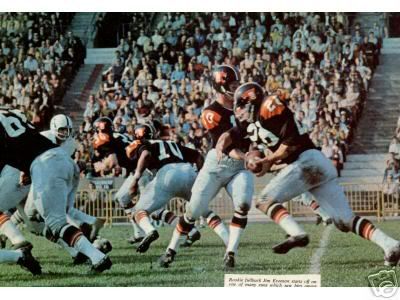
The high point, of the Cardiac kids season of 1977, was a thrilling 33-32 Western Semi Final win at rain soaked Empire Stadium against Ralph Brock and the Winnipeg Blue Bombers. I would like to see the Lions return to these helmets with orange home jerseys and away white jerseys with the Reebok company along with the CFL making exact duplicates as the future main uniform of the Lions for the "open roof "era of Lions football at BC Place. With the Whitecaps in there it just might start to feel like old Empire with these uniforms unearthed for Lions Fans! The Cardiac Kids of 1977 were the most entertaining team in Lion's history to not win a Grey Cup. Poetic justice would be to see a Lions team win the Grey Cup in these uniforms. :beauty:
Last edited by tigerrr22 on Sat Dec 13, 2008 8:25 am, edited 4 times in total.
Rick James
Legend
Posts: 1244
Joined: Thu Mar 06, 2003 2:49 pm

I have a helmet like that and I get a lot of comments that it is some peoples favourite.

I got more than a few people say that to me while wearing it at some of the grey cup parties in Montreal,
tigerrr22
Starter
Posts: 157
Joined: Thu Dec 11, 2008 10:51 pm

I also like that the Lion's head faces forward on both sides of the helmet unlike the current logo. The current logo sees the B and the C take over the entire logo too much. The Lions head is facing backwards on one side of the helmet with the B and C so predominant in the current logo. Also the Lion's head is not really roaring. It looks too docile to be on a football helmet. Here is a look at how the 1977 helmet looked on the left side of the player's heads. It's a picture of Jim Young, before 1977, but the logo was the same as in 1977 and facing forward on both sides of the helmet.
[URL=http://img211.imageshack.us/my.php?imag ... 721un1.jpg]Image[/URL
These 1977 helmets and uniforms were ahead of their time. They'd look just as sharp in today's game as they did back then. Also the double orange centre striping, we saw on the 1977 helmet , was very modern. You see this kind of striping in todays NFL.
Also the roaring Lion's head with smaller B and C inside the head would be great on all letterheads, the CFL website home page with the other teams, and in any print advertising. The logo says it all. It's BC, it's classic, aggressive and the logo of Lion's fans of all ages. (Past, present and future.) Fans over the age of fourty will love it and younger fans will learn to love it. This logo can only be a symbol of success. The older guys in the alumni would love it too!

Does anyone out there know where any of these old Lion's helmets could be bought? Be great to own a classic collectible 1977 Lions helmet. Game worn preferrably.
Last edited by tigerrr22 on Sat Dec 13, 2008 10:44 pm, edited 4 times in total.
User avatar
David
Team Captain
Posts: 9370
Joined: Thu Oct 03, 2002 10:23 am
Location: Vancouver (Kitsilano)

NOTE - I've moved this out of the Collectors Forum as this topic always inspires great debate on this board and I think it will be seen by more posters here.

First, welcome to Lionbackers tigerrr22. I think your idea has a lot of merit - ushering in a new 'open roof' era at BC Place by going back to a classic Lions uniform. I would suggest the best way to try and effect change is to send an email to George Chayka at the Lions' office and copy their Marketing Director (Terri Breker?).

Regarding the old logo, while I have grown to like to current one, I agree that the 'roaring lion' (worn on helmets from 1967 - 1977) is a superior design and looks more 'ferocious.' And I think you'll find many here agree that we need to make the switch back to black helmets. :beauty:

I think the club really got it right in 1976 and 1977 (they looked even better in person!) and would fit right in today. I would also not mind if we returned to the 1964 look too. Either '64 permanent with the '77 uniform as the 3rds or vice versa. IMO it would be an definite upgrade over today's "A&W Employee Of The Month" uniform.


DH 8)
Roar, You Lions, Roar
User avatar
David
Team Captain
Posts: 9370
Joined: Thu Oct 03, 2002 10:23 am
Location: Vancouver (Kitsilano)

Here are some better pics of the old Lions helmets. No, this isn't mine. This is actually a game worn Don Moorhead helmet from 1974 that was selling on Ebay last year. IIRC it went for over $2,000! It's a little worn but a gorgeous design. NOTE - in 1977 the club painted the facemask orange which was a nice touch.

ImageImage

DH 8)
Roar, You Lions, Roar
tigerrr22
Starter
Posts: 157
Joined: Thu Dec 11, 2008 10:51 pm

Wow. That is the best football helmet that pro football has ever seen. The logo is classic. Ferocious too! With Orange face masks (in 1977) and also with the double orange centre stripe (1977) this is the helmet the Lions should wear in 2011. Along with the jerseys.
61e1_1.jpg
With 1977 being 31 years ago this means that any fan over the age of 40 would remember these uniforms. Nostalgic and appealing memories could be found from the 1977 uniforms in 2011. And the fourty years old and up fans now have kids of their own to bring to the games.

These 1977 retro uniforms would be nostalgia for Gen-X fans who work and are still living unlike the 1964 uniform idea too. So in 2011 (Beginning of the open roof era at BC Place) I think the emotional appeal of the 1977 look would register with ticket buyers and their kids too. Of course there are the tweener fans who drink beer and do not have kids of their own yet and they would love the uniforms too.

But when I think that the Lions went from these black helmets with the orange Lion head logo roaring with fangs to the white helmets in 1978 it would be like the Oakland Raiders going to a white helmet instead of their silver classics. Or the Chicago Bears going to white helmets instead of their classic navy blues. It just isn't right.

What a collectors item that Don Moorehead helmet is. That has got some serious value appreciating over time. At $2000 I would say that was a good investment for the winner of that ebay auction. Be worth double in 15 or 20 years I bet! Great photos to see. Does anyone know the email address of Chayka and the marketing department of the BC Lions? They have got to look at this idea for the 2011 season! And not just 2011. But for many years after as the primary uniform of the BC Lions! :bb:

Dominic In Vancouver
You do not have the required permissions to view the files attached to this post.
Last edited by tigerrr22 on Tue Dec 16, 2008 5:12 pm, edited 3 times in total.
User avatar
Honour Dewalt
Champion
Posts: 530
Joined: Wed Nov 27, 2002 11:21 pm

Well, i would be interested in seeing that one, since we have already used the paw, but I still think they already have one of the best logos.
This might be used as part of the retro theme the league is doing. They did say they were going to go through different eras with that, so maybe this will be the era the Lions use.
User avatar
mws
Starter
Posts: 116
Joined: Sun Oct 06, 2002 2:16 pm
Location: Toronto
Contact:

Great logo, but still prefer the circa '63 '64 uniform. The black jersey was the best as well as the meanest. White pants at home, black on the road.
User avatar
Ravi
Legend
Posts: 1051
Joined: Fri Nov 12, 2004 9:01 pm
Location: St Catharines, Ontario

I can trace the beginning of my following of the CFL to about 1976 when I was a young child and I do recall the '77 Cardiac Kids team. I remember watching that playoff game and I also seem to recall a thrilling last minute win in Ottawa that year too. Anyway, I agree that these are the best uniforms and helmets that the Lions have worn during my lifetime. You have to wonder why change from such great uniforms?

I ask that same question with the Argos whose best unis ever may have been in the 1979-80 era although the uniforms after that, while not quite as good, stayed at a high level until the end of the '88 season. The logo that the Argos had on their helmets back then are absolute classics.

Why do the 1970s era uniforms and logos appeal to so many of us so much? Is it just nostalgia or are they actually sharper than what we see today? What do the younger folk on here think about the 1970s era uniforms and logos?
User avatar
B.C.FAN
Team Captain
Posts: 12591
Joined: Mon Nov 15, 2004 10:28 pm

Ravi wrote:I can trace the beginning of my following of the CFL to about 1976 when I was a young child and I do recall the '77 Cardiac Kids team. I remember watching that playoff game and I also seem to recall a thrilling last minute win in Ottawa that year too.
Indeed, B.C. scored 16 points in the final 29 seconds to win by one. I think of that game every time I see people heading for the exits before the game is over.
User avatar
David
Team Captain
Posts: 9370
Joined: Thu Oct 03, 2002 10:23 am
Location: Vancouver (Kitsilano)

This is another favorite of mine. The 1970 and 1971 Lions wore the cool black helmets that tiggger22 referenced but with black jerseys and 7 burnt orange rings on the sleeves, which were much longer in those days (they went past the elbow).

I wouldn't mind seeing this same look today but with 5 rings on the shoulder sleeves (symbolizing the franchise's 5 Grey Cups), and the numbers on top of the shoulders.

ImageImage

DH 8)
Roar, You Lions, Roar
User avatar
Lions4ever
Hall of Famer
Posts: 3430
Joined: Wed Oct 02, 2002 7:25 pm
Location: Vancouver Island

Great pic David. I loved those uniforms - they didn't stick around nearly long enough IMO.

Loved Ted Gerela too.
User avatar
Bleddyn
Starter
Posts: 154
Joined: Thu Oct 30, 2008 9:52 am
Location: San Diego CA, displaced from Richmond

I agree that the 77 helmet with the orange facemask was a classic, I would love to see that helmet for BC retros, and this jersey:

Image
Circa 68 pic was put up in another thread by David

Those ones have my vote for best of all time. The 70 - 71's shown by David above would be second. Although I love the 77 helmets, the jerseys were too much in a style I associate with the 80's... not vintage looking enough.
tigerrr22
Starter
Posts: 157
Joined: Thu Dec 11, 2008 10:51 pm

You guys! Burnt Orange with the black numbers that have the white trim is it! Think about the age of colour television sets! I would suggest the Lions offer up these other mentioned black retro jerseys as third jerseys in 2011 but let's get the orange 1977 jerseys together first! The black numbers do not suggest A & W employee of the month to me with these orange jerseys! Just sharp uniforms with those awesome black helmets. The logo on these helmets is the best of all time in pro football. Kicks serious butt on the lions' logo of today!

The seventies seem to be glory for many things too! Muscle cars with style. Houses that could be bought by average joes who work in the local ecomomy! The NFL does the seventies too! look at the NY Jets! Joe Namath era uniforms! The NY Giants have a seventies look too.

How about the Vancouver Canucks with their vintage blue 1974 uniforms we saw a couple of seasons ago! Classic, nostalgic and simple solid style that has an emotional appeal to the fans of the past while being relevant for fans of today and developing the teams uniforms for tommorrow's fans too!

Open roof era football will be a buzz for the team to capitalize on at BC Place in 2011. The black 1977 helmet with orange face mask has got to be the helmet for the team and hopefully burnt orange home and white away uniforms identical to the 1977 Cardiac Kids. I remember that thrilling game in Ottawa as well. What a spectacular game to behold. I was ten years old and that was the day I decided that Jerry Tagge was the greatest football player of all time! He also threw a few ducks in his day (like me) but he was a gun slinger! All or nothing through the air with Jerry Tagge!

I am trieing to get Chayka to read this thread in regards to uniforms for the 2011 season. No response today to my email via community relations passing the link to Chayka's intraoffice emall but I will keep trying. Please share your thoughts in this thread and show BC Lions team management that you want the black helmets a la 1977 in 2011! Don't just read the thread. Post here to show the team this is what we want! Well I'm back in black!! (ACDC glory!)

Dominic In Vancouver
You do not have the required permissions to view the files attached to this post.
Post Reply