BC Lions Logo Question
Moderator: Team Captains
You know it is the offseason when i bring this bit of hard thinking to the table 
 anyway, i was wondering about the slight change in the lions logo where today it does not have the 3 spots on the face of the lion. Is there a reason behind this and when did it happen? thanks in advance for the answer Robbie :lol: :lol: !!
Thank you for everything you did for OUR Lions Mr.Ackles, we will never forget you...RIP
-
pinkfreud
You know it's a culture obsessed with perfection when they start airbrushing flaws off football logos.

are you saying the lion was concerned about its complexion?? :lol: :lol:pinkfreud wrote:You know it's a culture obsessed with perfection when they start airbrushing flaws off football logos.
Thank you for everything you did for OUR Lions Mr.Ackles, we will never forget you...RIP
Amazing observation, Lion24! I'm afraid I cannot give you certain answers.
All I can say is that by the 2005 season, the three dots were gone as indicated by this picture from 2005:

A quick check of the Sports & Stuff web site indicates that the three dots are missing from all t-shirts and hats. However, they still appear on other souvenir items such as mugs, shot glasses, and flags. I don't know when the souvenirs were designed.


http://www.lionbackers.com/cheer/album_ ... pic_id=860
http://www.lionbackers.com/cheer/album_ ... pic_id=661
All I can say is that by the 2005 season, the three dots were gone as indicated by this picture from 2005:

A quick check of the Sports & Stuff web site indicates that the three dots are missing from all t-shirts and hats. However, they still appear on other souvenir items such as mugs, shot glasses, and flags. I don't know when the souvenirs were designed.


http://www.lionbackers.com/cheer/album_ ... pic_id=860
http://www.lionbackers.com/cheer/album_ ... pic_id=661
I just did a quick check of some of my keepsakes that bear the logo.
(1) Lui's Babooshka doll: this came out during the 2004 season to commemorate his HOF induction at that time. The team logo appears on the box in which it was distributed. NO dots.
(2) 2004 team portrait: this was comped to 2005 ST holders in late 2004 or early 2005. The logo appears in the upper left. NO dots. The team logo also appears on the clothing of all the players and coaches, but the photo quality simply isn't good enough to distinguish the presence of the those dots.
(3) Geroy Simon trading card with stats from 1999 through 2004, also comped to 2005 ST holders. This is more interesting. It's difficult to tell without a magnifying glass but the dots are missing from the logo on his helmet in the photo on this card; the logo is also on his sleeve, and while it's inconclusive to my eye, it probably matches his helmet (i.e., no dots). But there's also a Lions helmet printed (not a photo but an animation) on the lower right corner, and there the dots DO appear (for that matter, the helmet also appears to have a single black stripe running down the middle as well, which I have never seen for real!). This case is a little clearer to the naked eye that in the photo.
(4) Sew on patch commemorating the Lions 50th season in 2003. The full logo does not appear on the patch, only the lion head. NO dots.
So they may have disappeared as far back as 2003.
Sports can be a peculiar thing. When partaking in fiction, like a book or movie, we adopt a "Willing Suspension of Disbelief" for enjoyment's sake. There's a similar force at work in sports: "Willing Suspension of Rationality". If you doubt this, listen to any conversation between rival team fans. You even see it among fans of the same team. Fans argue over who's the better QB or goalie, and selectively cite stats that support their views while ignoring those that don't.
The shirt worn by Braley in this picture after the 2000 Grey Cup win shows the dots.
http://www.lionbackers.com/cheer/album_ ... pic_id=437
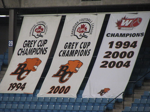
The banners commemorating the Grey Cup wins show them as well. But as I stated in other threads, the logos used for the banners are not very accurate anyways because the logos that appear on the 1964 and 1985 banners are not actually the logos that were used by the Lions during those seasons. And repeating what I stated earlier, I hope for the 2006 banner, the Paw logo will be used because that was the uniform they used during the 2006 Grey Cup game.

And speaking of the banners, what is also inaccurate about the 1964 banner is the CFL logo that appears on it. The one that appears on all four banners was the one that was in use from 1970 to 2002.
From 1958 to 1969, the CFL logo was:

And for the 2006 banner, I hope it is designed so that it shows the modern CFL logo as well.

The two banners indicating the West Division Championship years were designed and unveiled at the home opener in 2005, and they use the contemporary CFL West Division logo. So there's a possibility that the 2006 Grey Cup banner will be "updated" as well.
From 1958 to 1969, the CFL logo was:

And for the 2006 banner, I hope it is designed so that it shows the modern CFL logo as well.

The two banners indicating the West Division Championship years were designed and unveiled at the home opener in 2005, and they use the contemporary CFL West Division logo. So there's a possibility that the 2006 Grey Cup banner will be "updated" as well.
while on this topic i was wondering if the West Coast Bomber fans could give me an answer on the change of the Bombers logo from the white to blue W; l like the current blue W! 

Thank you for everything you did for OUR Lions Mr.Ackles, we will never forget you...RIP
- AC/DC Rocks
- Champion
- Posts: 924
- Joined: Thu Jul 28, 2005 9:09 am
- Location: Surrey
I knew you would know thisShelion wrote:The whiskers were removed (or plucked :lol: ) in 2002.
Little surprised to see it was 2002, I was thinking maybe a couple seasons ago.
I have an old Lions pennant and the letters BC are orange and the lion is brown. I must admit I prefer the current colours black BC and orange lion.
Bighill is Badass
As mentioned, the changes to the logo were done in 2002. The shade of orange was changed to a slightly lighter tone, the whiskers were removed and the line of the tongue was straightened slightly. It was supposed to make the logo cleaner and crisper if I recall...
Hey everyone, check out the web site that I just found. I think you will all love it! 
This web page shows diagrams of all the historical CFL helmets that were used by every team, and provides the specific dates when they were in use. There is a link that shows the helmets of all the Grey Cup winners every year. But that page isn't quite accurate as it only shows the current helmet of every team and not the design that was specifically used during that year.
To answer your question, Lion24, according to the site, the blue W was introduced in 2005. I think you will find this site very informative and it will also answer any remaining questions you have about CFL team logos.
http://www.nationalchamps.net/Helmet_Project/cfl.htm

