
2019 All Things Lions Marketing & Promotions
Moderator: Team Captains

Thanks for the link. It looks like they are relying on the white outline being enough to differentiate the black BC letters from the black helmet. (Since black on black was never done last time black helmets were used regularly, maybe they haven't thought it through very well. No surprise considering how we ended up with "chess piece" Lions in the last iteration.)squishy35 wrote: ↑Wed May 22, 2019 2:34 pmYou can see the new lids in this video from today's practice: https://www.bclions.com/2019/05/22/devo ... ks-may-22/
I like them a lot. A more traditional look but clean and exciting. Much improved over the last couple of years. Maybe a paw logo for 1-2 games a year?
Hopefully, they stick with this look.
DH
Hopefully, they stick with this look.
DH
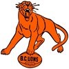
Roar, You Lions, Roar
-
Zarquon

- Champion
- Posts: 631
- Joined: Sun Sep 25, 2005 7:49 pm
- Location: Vancouver and BC Place Section 215
- Contact:
I preordered one of the new Jerseys back in Feb. It shipped today and is expected to arrive tomorrow. I'm guessing that the jersey launch will also be tomorrow as a result. But that is just a guess.
Meus occupatio est ut calcitro vestri clunis.
-
Honour Dewalt
- Champion
- Posts: 530
- Joined: Wed Nov 27, 2002 11:21 pm
Finally! Revealed. And my theory on the road uni pants was wrong. They are orange on the road. Looks good. Home uni looks great! (So far from the video)
Side note. Cool video New Era put out. Each team also has their own video, but the one I saw on the New Era Cap twitter is better with the play by play of the 94 Grey Cup win.
Side note. Cool video New Era put out. Each team also has their own video, but the one I saw on the New Era Cap twitter is better with the play by play of the 94 Grey Cup win.


Let me echo the good riddance to the creamsicle set. The uniforms are an improvement over the previous generation just based on the number outlining alone.
I guess I'm in the minority on the helmet, largely because I grew up on the Michigan Panthers style logo and though the Lions adaptation of it on the black helmet, was terrific. I can't argue with the return to the traditional logo and the associated 1970s era wide stripe and orange influence, though.
All in all, nice tweaks by New Era and here's hoping we get a couple of years of consistency out of them.
*Edited to Add* I like the British Columbia on the road uniforms. I wish more of the apparel emphasized the full province name over the shorthand.
-
SammyGreene

- Team Captain
- Posts: 8083
- Joined: Sun Oct 06, 2002 11:52 am
Their best road unis since the 1970s. Love the "British Columbia" too.
Good riddance Adidas especially the flat out awful roads.
Good riddance Adidas especially the flat out awful roads.