
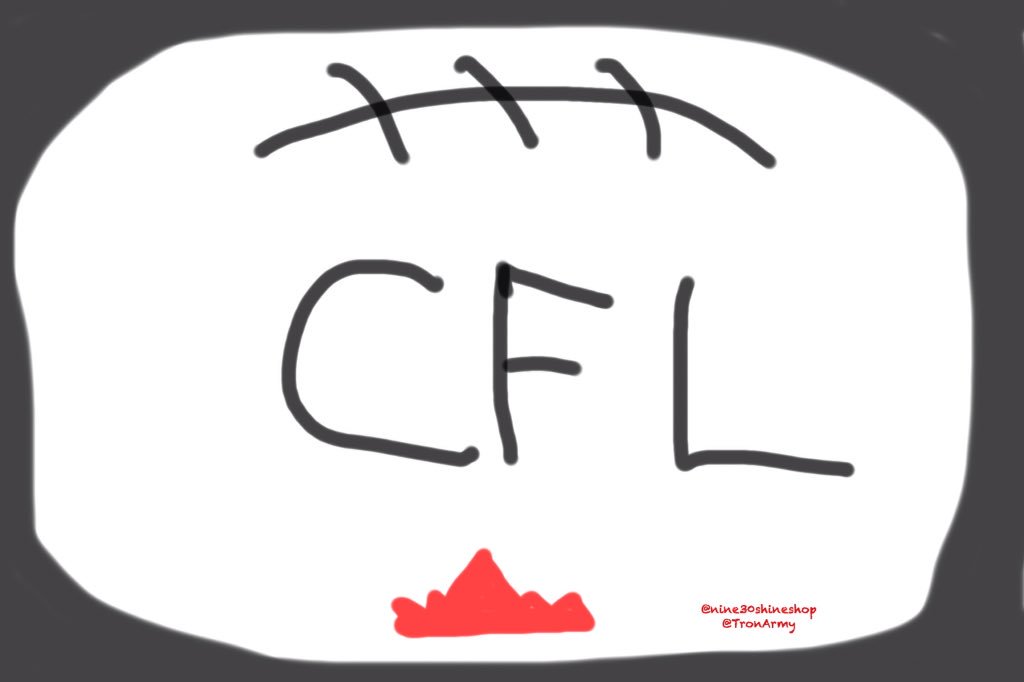
CFL New Logo
Moderator: Team Captains

-
aklawitter

- All Star
- Posts: 426
- Joined: Sun Nov 11, 2012 2:14 pm
did somebody not get the memo that this is a joke?
oh, it's not an early april fools prank?
good lord
what's with the petro canada logo
this... is... BALLS
oh, it's not an early april fools prank?
good lord
what's with the petro canada logo
this... is... BALLS
-
Honour Dewalt
- Champion
- Posts: 530
- Joined: Wed Nov 27, 2002 11:21 pm
Logos don't always need to be complex to be good. Just because a child could draw it means nothing. A child can draw the NHL and NFL logos as well. The production value on the video is very high and has some good quality NFL films style shots which look great. I love the slow motion. Usually CFL commercials only have game broadcast angle footage with no production quality and has no intimacy.
I was thinking the maple leaf could have been bigger and behind the letters but a comment above about a broader appeal does make sense.
I'm cool with it overall. Not the best song choice, but not terrible either.
I was thinking the maple leaf could have been bigger and behind the letters but a comment above about a broader appeal does make sense.
I'm cool with it overall. Not the best song choice, but not terrible either.
-
TheLionKing
- Hall of Famer
- Posts: 25103
- Joined: Sat Feb 19, 2005 10:13 pm
- Location: Vancouver
Epic fail. You would think they would get the laces right.

I think what's more jarring than the logo itself is the timing of this change. The previous one with the red football protruding from a red maple leaf atop the CFL lettering had only been in use for 13 years. When it was introduced during the 2002 Grey Cup Week, the timing felt right for a reboot on the old helmet logo that had been in use since 1969.
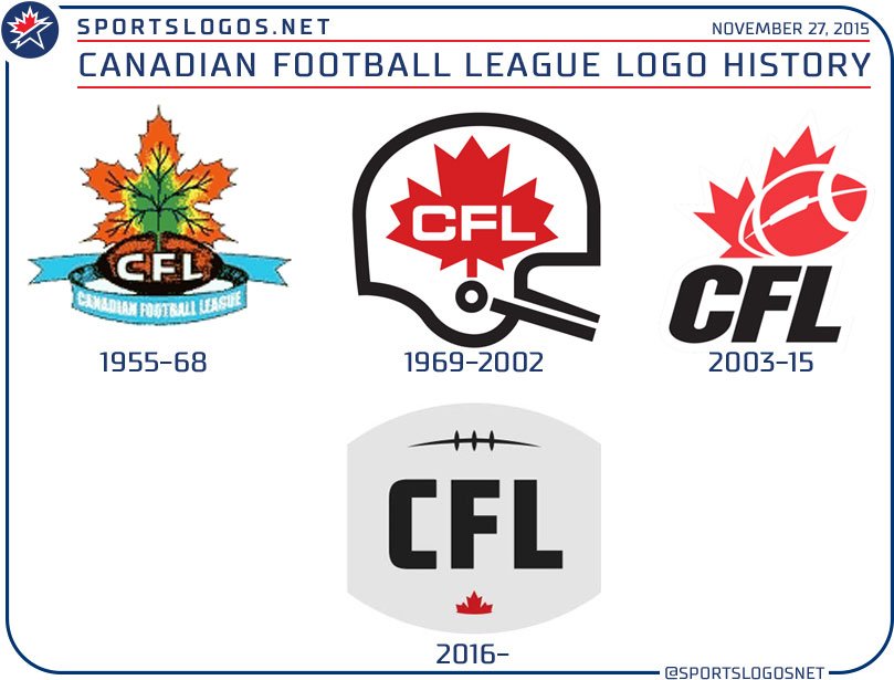
Other leagues have changed their logos but not with this type of frequency or degree of change. The NHL revamped their logo coming out of the lockout that ended in 2005, although the changes weren't that drastic from the previous shield one had been in use since 1946, which itself was a slight alteration of the original the league had used since its inception.

The NFL's current shield logo has been in use since 2008 and is a slight alteration of the previous one that was adopted in 1970 at the time of the NFL/AFL merger.

Part of the motivation for the new CFL logo is that it is easy to reproduce on a variety of scales and reproduces well across digital platforms. The laces for example are only in a stylised version, much like the striping of the Tiger-Cat on the Bob Young-era Hamilton logo. The G&M made this point in their article: CFL rebranding to show new fans ‘what we’re made of’. Wonder if Tom Mayenknecht will have much to say about this new branding on his show this morning. The G&M article appears not in their sports section but rather in business.
Excerpt:
Other leagues have changed their logos but not with this type of frequency or degree of change. The NHL revamped their logo coming out of the lockout that ended in 2005, although the changes weren't that drastic from the previous shield one had been in use since 1946, which itself was a slight alteration of the original the league had used since its inception.
The NFL's current shield logo has been in use since 2008 and is a slight alteration of the previous one that was adopted in 1970 at the time of the NFL/AFL merger.
Part of the motivation for the new CFL logo is that it is easy to reproduce on a variety of scales and reproduces well across digital platforms. The laces for example are only in a stylised version, much like the striping of the Tiger-Cat on the Bob Young-era Hamilton logo. The G&M made this point in their article: CFL rebranding to show new fans ‘what we’re made of’. Wonder if Tom Mayenknecht will have much to say about this new branding on his show this morning. The G&M article appears not in their sports section but rather in business.
Excerpt:
As for the aesthetics of the new logo I agree it looks rather bland with all that drab pale grey taking up so much of the visual field. Perhaps more of a silver- or pewter-looking shade would have looked better.This rebranding initiative, which has been in the works for a year and a half, is designed to appeal to [younger consumers], as well as to new Canadians for whom football as we know it — as opposed to soccer — may be unfamiliar.
The new logo is meant to work better, from a design perspective, on a number of different backdrops, including digital.
...
There has not been time to completely revamp the TSN broadcast with the new logo imagery for Sunday’s [Grey Cup] game... . The full launch of the new look will happen with CFL marketing toward the beginning of next season, which will coincide with the release of new Adidas uniforms.
Sports can be a peculiar thing. When partaking in fiction, like a book or movie, we adopt a "Willing Suspension of Disbelief" for enjoyment's sake. There's a similar force at work in sports: "Willing Suspension of Rationality". If you doubt this, listen to any conversation between rival team fans. You even see it among fans of the same team. Fans argue over who's the better QB or goalie, and selectively cite stats that support their views while ignoring those that don't.
A logo is just small part of a branding strategy, though it is often the logo that is the focus of attention whenever a branding change is made. I'd suggest that colours, fonts, photo/video style, narrative strategy, etc have a bigger overall impact on a brand's impression on the marketplace.
No matter how fine a logo might be--and I'm not saying that this new logo is great, as i don't really care one way or another--it is inevitable that there will be a wide variety of opinions about it.
Ultimately, as long as the logo is functional and consistent from a marketing perspective and not too silly or offensive to the audience, it is doing it's job and not really very important on its own.
-
WestCoastJoe

- Hall of Famer
- Posts: 17721
- Joined: Mon May 22, 2006 8:55 pm
This fan likes the 2003-2015 CFL logo much better than the new one.
Sense of movement vs chopped off, colourless, grey. 2016 --> Tiny partial maple leaf. Flat, boring letters.
NFL. I like the new one better. Fewer stars = less clutter. Football looks better, cleaner. Letters similar, but better without the flourish on the L.
NHL. I like the old one better. Stronger colours. Although the shape of the new one is stronger IMO.
Nice work, sj.
I love logos. They communicate a lot in a glance. Picture > Words.
John Madden's Team Policies: Be on time. Pay attention. Play like hell on game day.
Jimmy Johnson's Game Keys: Protect the ball. Make plays.
Walter Payton's Advice to Kids: Play hard. Play fair. Have fun.
Jimmy Johnson's Game Keys: Protect the ball. Make plays.
Walter Payton's Advice to Kids: Play hard. Play fair. Have fun.

The new logo looks like they made a logo, but then decided to crop 1/3 of the outside area (only using the centre). Cropping the ends of the ball could subtly indicate stripes vs no stripes on the NFL game ball.
The retro font reminds me a bit of the original Ottawa Rough Riders primary logo (which used similar lettering on the ball).
http://www.sportslogos.net/logos/view/1502
I agree that only slight modifications to a long standing brand is a better idea (like the evolving of the NHL and NFL logos.)
The retro font reminds me a bit of the original Ottawa Rough Riders primary logo (which used similar lettering on the ball).
http://www.sportslogos.net/logos/view/1502
I agree that only slight modifications to a long standing brand is a better idea (like the evolving of the NHL and NFL logos.)

Hey all,
Well, I don't think the new logo is anything to write home about, but...we weren't given the rationale for changing it. I suspect this wasn't change for change's sake and that a lot of little things played into the design. The new logo, frankly, will work beautifully as an avatar on Twitter/Facebook, etc., and is a smart design in that the visual focus is 'CFL' rather than the red of the maple leaf/football. A grey and black logo, with the tinniest bit of red is probably easier for producing branded clothing as well. It doesn't really clash with much. So maybe that was a consideration?
It'll grow on us.
Cheers,
James
-
CardiacKid

- Legend
- Posts: 1949
- Joined: Sat Jul 14, 2012 9:46 am
- Location: Under Christmas Hill, Saanich
The CFL media panel on TSN just tore Orridge apart as being far too ignorant of the CFL in general and dangerously clueless as to what is troubling the league.

To his credit, Orridge has been widely available at this year's Grey Cup. He came ready to mix and mingle; as open with the press as he's been with the public. Problem is, he should have taken a cue from his counterpart down south and been harder to pin down than Brock Lesnar.CardiacKid wrote:The CFL media panel on TSN just tore Orridge apart as being far too ignorant of the CFL in general and dangerously clueless as to what is troubling the league.
The thing is, when Orridge opens his mouth, words come out - lots of them - but sound ideas seldom form. Quite simply, he lacks substance. Is that unfair judgment on someone who's been on the job 7 months? Perhaps. But I'm getting a little tired of the slick Marketing speak and evasive answers to simple questions. The "American by birth, Canadian by choice" schtick can be retired anytime soon as well. Eventually he's going to have to break script and open up. I would respect him a lot more if he'd be honest about the league's challenges instead of constantly spinning every issue. It would certainly would appear that others are getting the same vibe:
http://www.winnipegfreepress.com/opinio ... 61331.html
http://www.thestar.com/sports/football/ ... rthur.html
DH
Roar, You Lions, Roar